Essential components of the 888poker design system, these icon libraries were crafted for scalability and uniformity, enabling efficient and consistent UI/UX design across platforms.
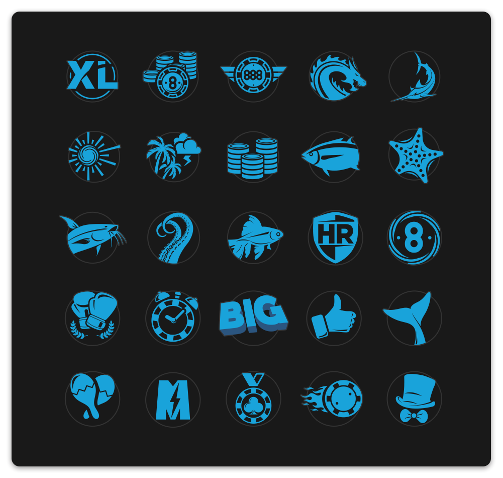
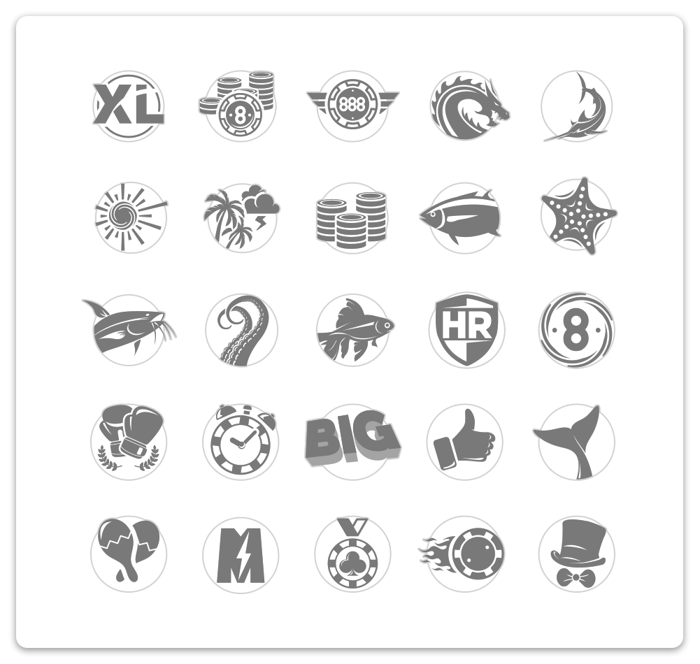
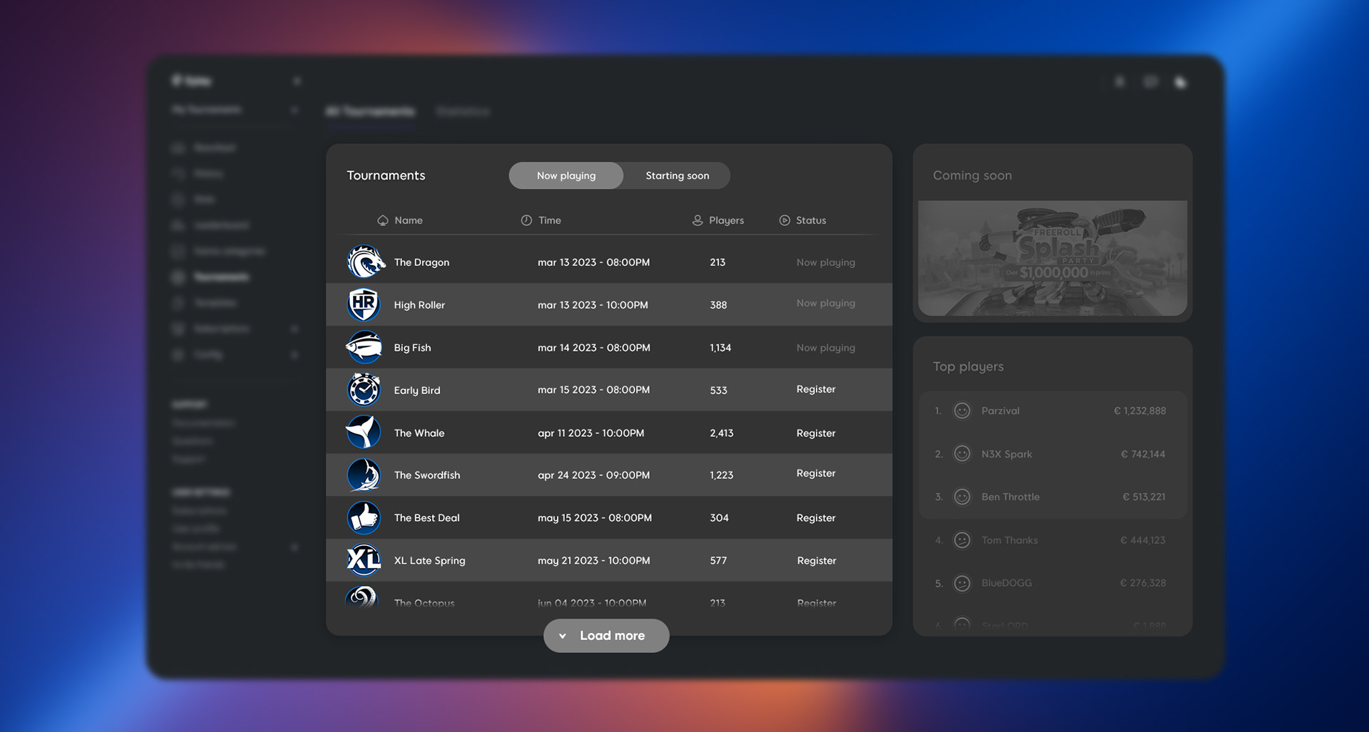
Project name #1: Tournament icons revamp
In an effort to revamp the company's brand and provide a more seamless user experience, I was asked to redesign all of the tournament icons. My primary objective was to create a consistent and modern visual language that would align with the sleek look and feel of our new poker client.
I tried to make each icon instantly recognizable and visually appealing and I aimed to add a more polished and professional look so that they would seamlessly integrate with the new app.
I believe that this redesign represented a significant step forward for the company's branding.


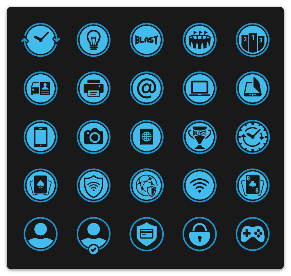
Project name #2: In-app icons family
This icon family was designed with a focus on consistency, simplicity, and balance, making sure each icon is clear and cohesive across different uses. Through careful iteration, I aimed to create versatile icons that work well on various platforms while maintaining a modern, minimalist style.This project highlighted the value of blending functionality with aesthetics, reinforcing my belief that good design should be both practical and visually appealing.