Campaign name: Pokerland
Objective: A weekly challenge protocol over a 30-day period for new players
Stages / Campaign Segments: A clear, detailed 4-week mission plan, with each week featuring a different theme for the missions, and weekly communications via an opt-in email detailing the missions for that week.
Goal: Increase engagement by attracting players to log in to the client after registration and by providing a smooth onboarding experience, which will also help players get to know our games and features through challenges. Additionally, the campaign will help promote 888poker’s agenda (games, deposits, etc.).
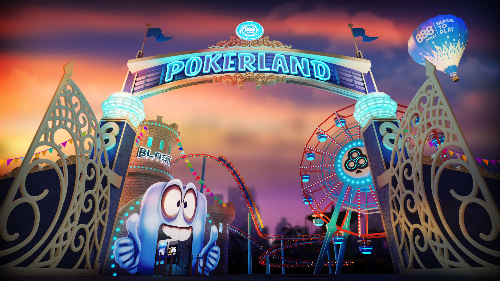
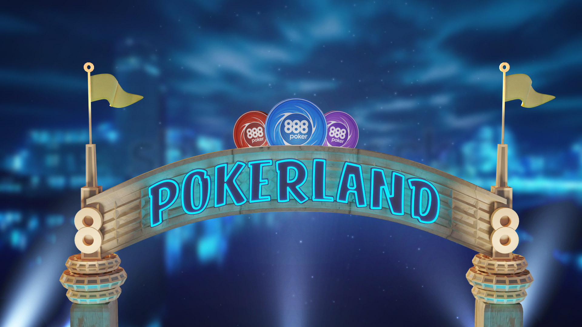
The path: The initial sketches focused on the entrance of a theme park, featuring a bold logo on top and park rides visible only through the gate. The concept was about entering the park / signing into the campaign, and getting a sneak peek of what taking this step would bring.
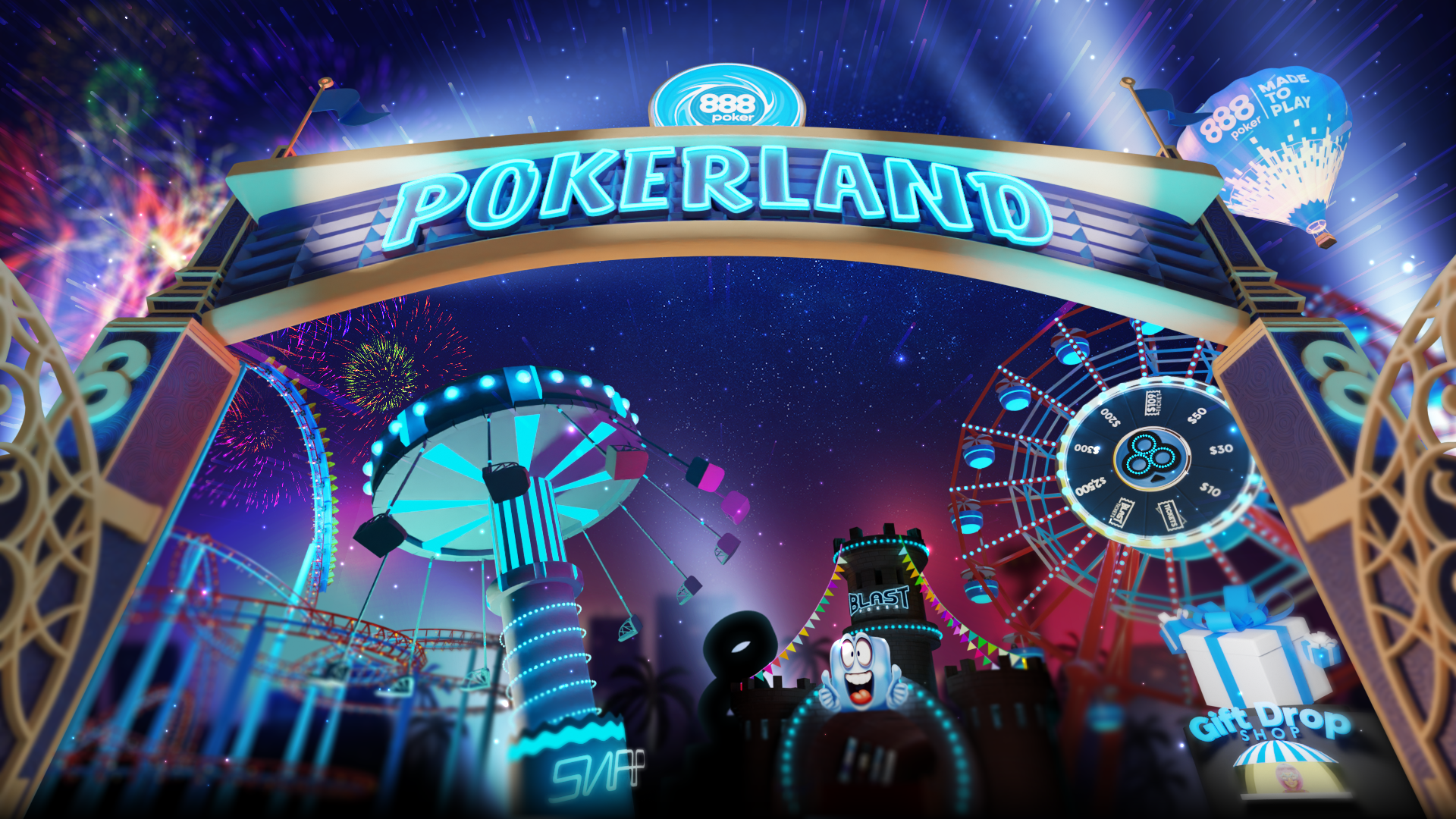
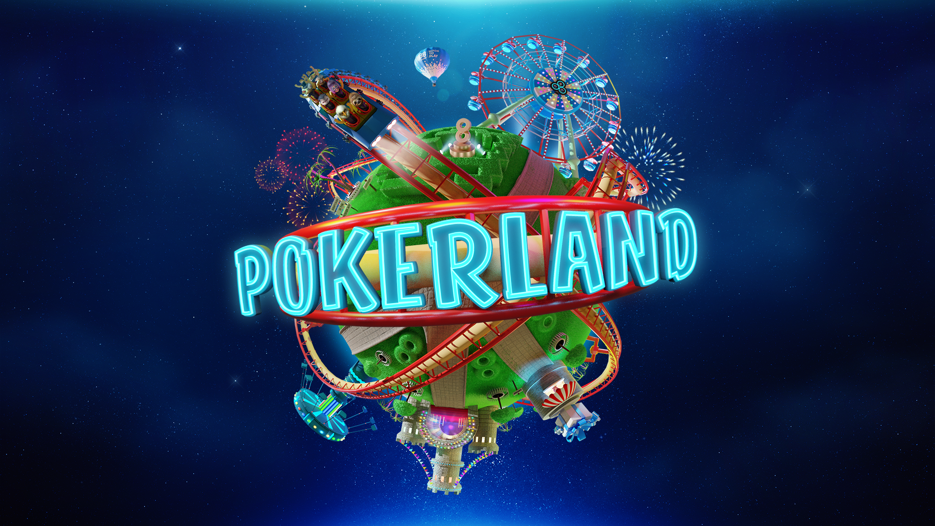
After several iterations, the idea of the 'Pokerland Planet' emerged, with the logo on a roller-coaster rail and various attractions scattered across a tiny planet. This approach was definitely stronger, as it moved away from the first-person game concept and shifted the creative direction toward a more fun, joyful, and engaging theme that had a much greater impact.
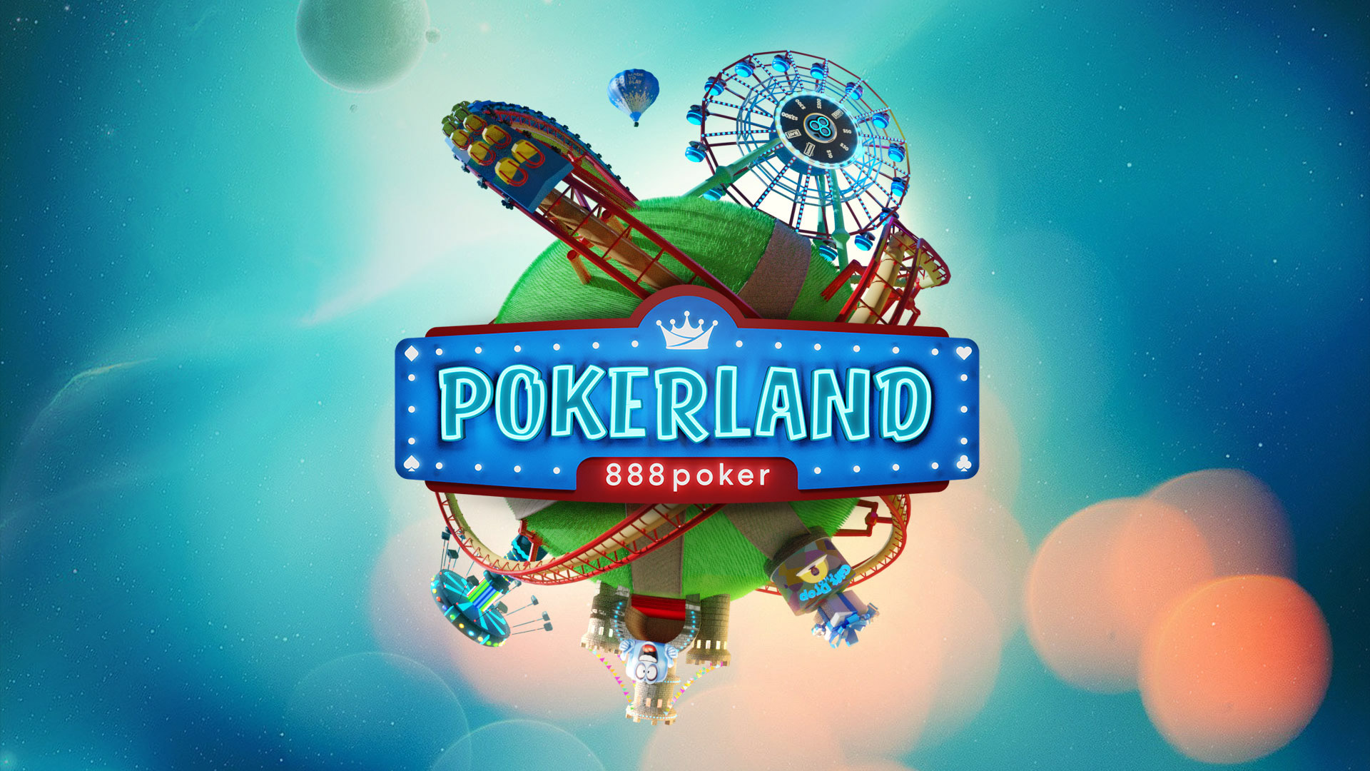
The logo: Bold, neon-style lettering, surrounded by various theme park elements, giving the impression of a whimsical, entertainment-focused place with an outer space twist. This design further emphasized the playful and immersive experience.
Goal: Increase engagement by attracting players to log in to the client after registration and by providing a smooth onboarding experience, which will also help players get to know our games and features through challenges. Additionally, the campaign will help promote 888poker’s agenda (games, deposits, etc.).
The path: The initial sketches focused on the entrance of a theme park, featuring a bold logo on top and park rides visible only through the gate. The concept was about entering the park / signing into the campaign, and getting a sneak peek of what taking this step would bring.
After several iterations, the idea of the 'Pokerland Planet' emerged, with the logo on a roller-coaster rail and various attractions scattered across a tiny planet. This approach was definitely stronger, as it moved away from the first-person game concept and shifted the creative direction toward a more fun, joyful, and engaging theme that had a much greater impact.
The logo: Bold, neon-style lettering, surrounded by various theme park elements, giving the impression of a whimsical, entertainment-focused place with an outer space twist. This design further emphasized the playful and immersive experience.

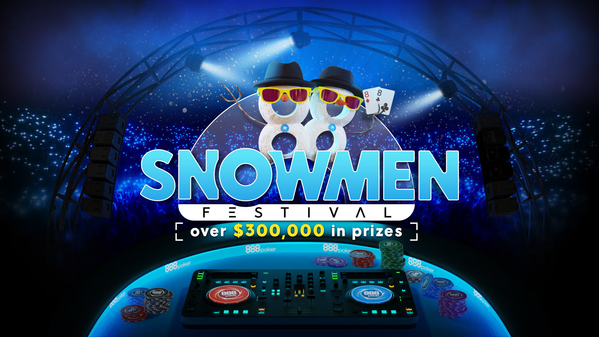
Task Description: Music Festival Theme
Objective: To create an engaging and dynamic Big Campaign with a music festival theme, featuring multiple stages, each representing a unique campaign or segment towards the end of the year.
Theme: Music Festival with multiple stages.
Stages / Campaign Segments: Each stage will be a campaign or a segment towards the end of the year, such as a Rakeback Promotion, Sale Week Tournament Series, Cash Challenges and more.
Goal: Increase player engagement and participation, boost overall revenue through targeted promotions and create a memorable and enjoyable experience for players.
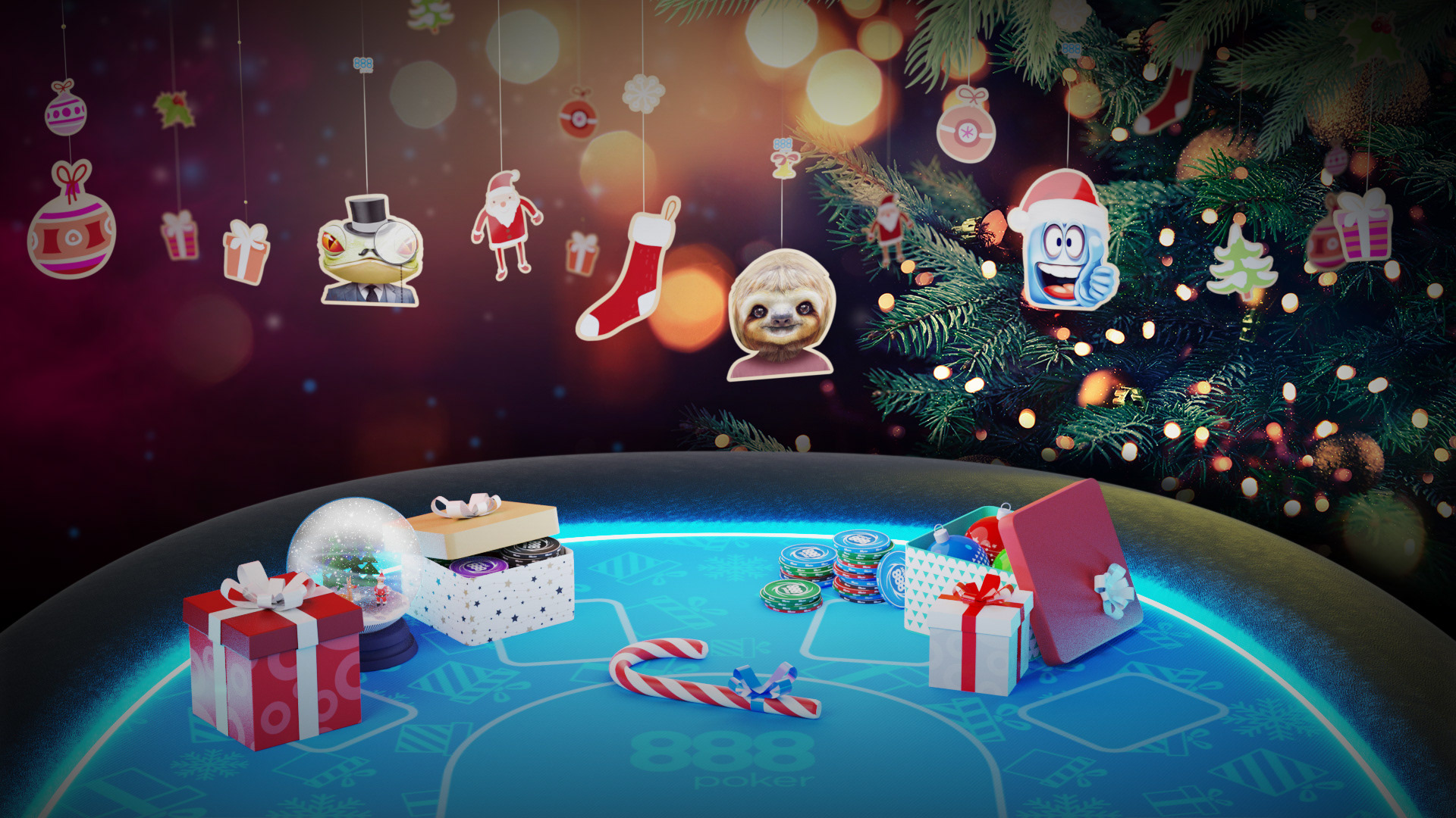
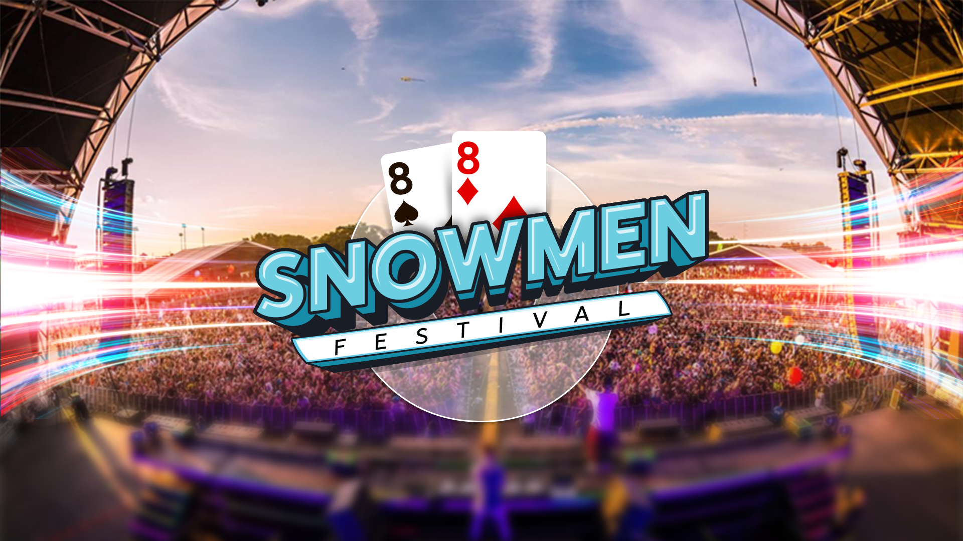
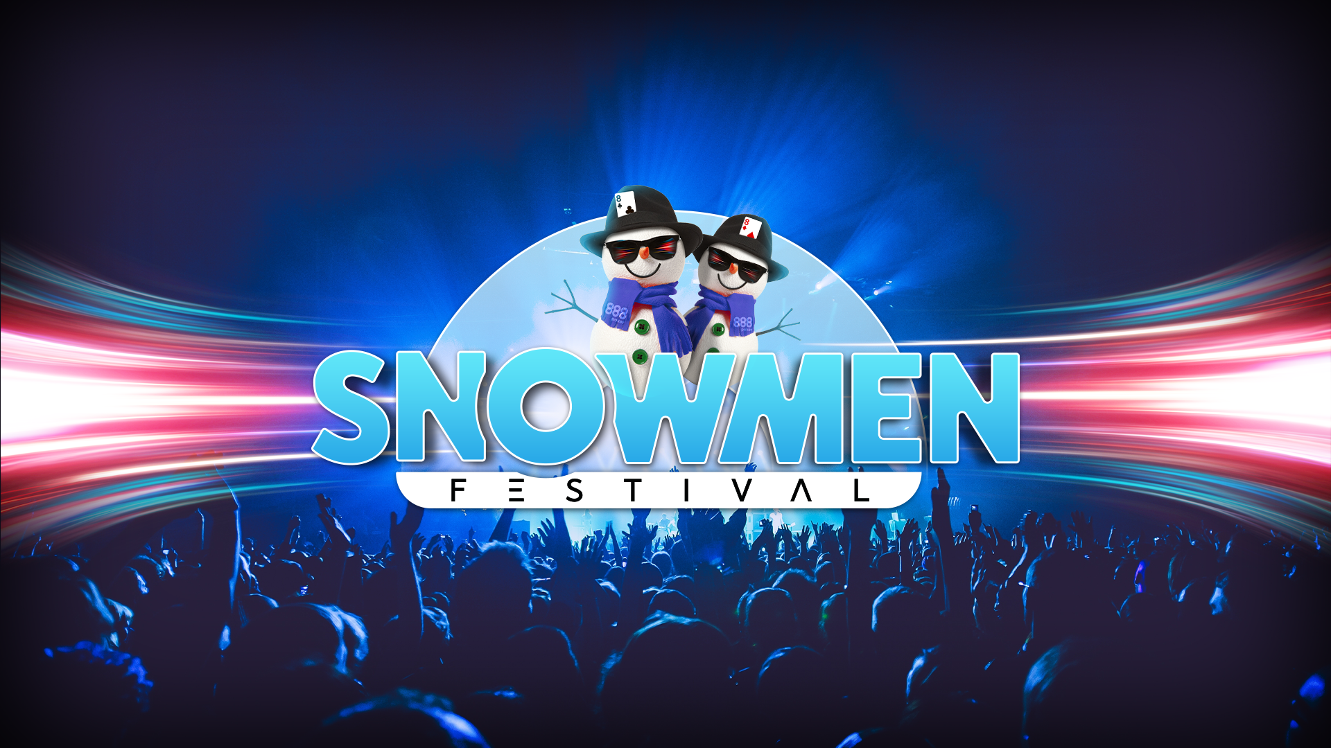
The logo: The title came after I started working on the moodboards and helped incorporate the concept of ‘Snowmen’ in poker, which refers to a pair of eights (8-8) due to their resemblance to snowmen. I believe this concept significantly contributed to the final logo and key visual layout. The snowmen were built in Blender.
Goal: Increase player engagement and participation, boost overall revenue through targeted promotions and create a memorable and enjoyable experience for players.
The logo: The title came after I started working on the moodboards and helped incorporate the concept of ‘Snowmen’ in poker, which refers to a pair of eights (8-8) due to their resemblance to snowmen. I believe this concept significantly contributed to the final logo and key visual layout. The snowmen were built in Blender.

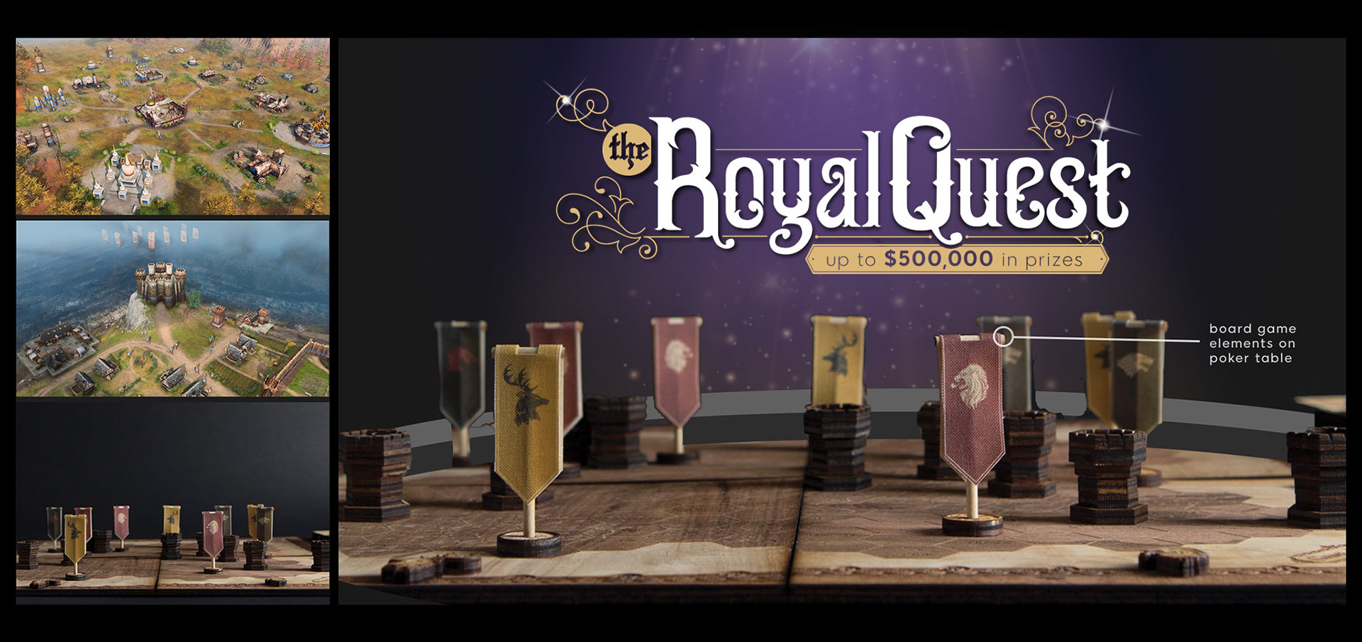
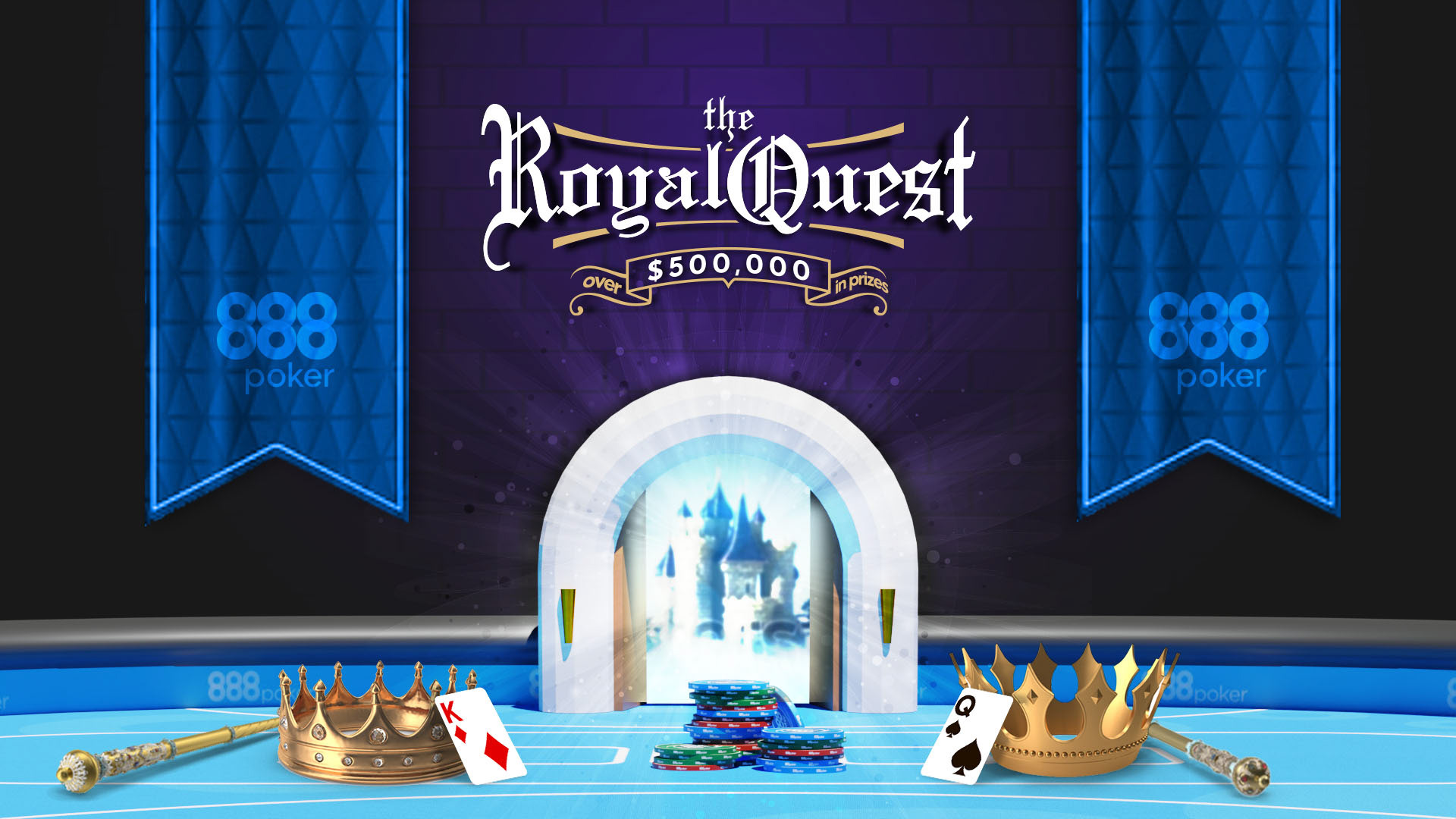
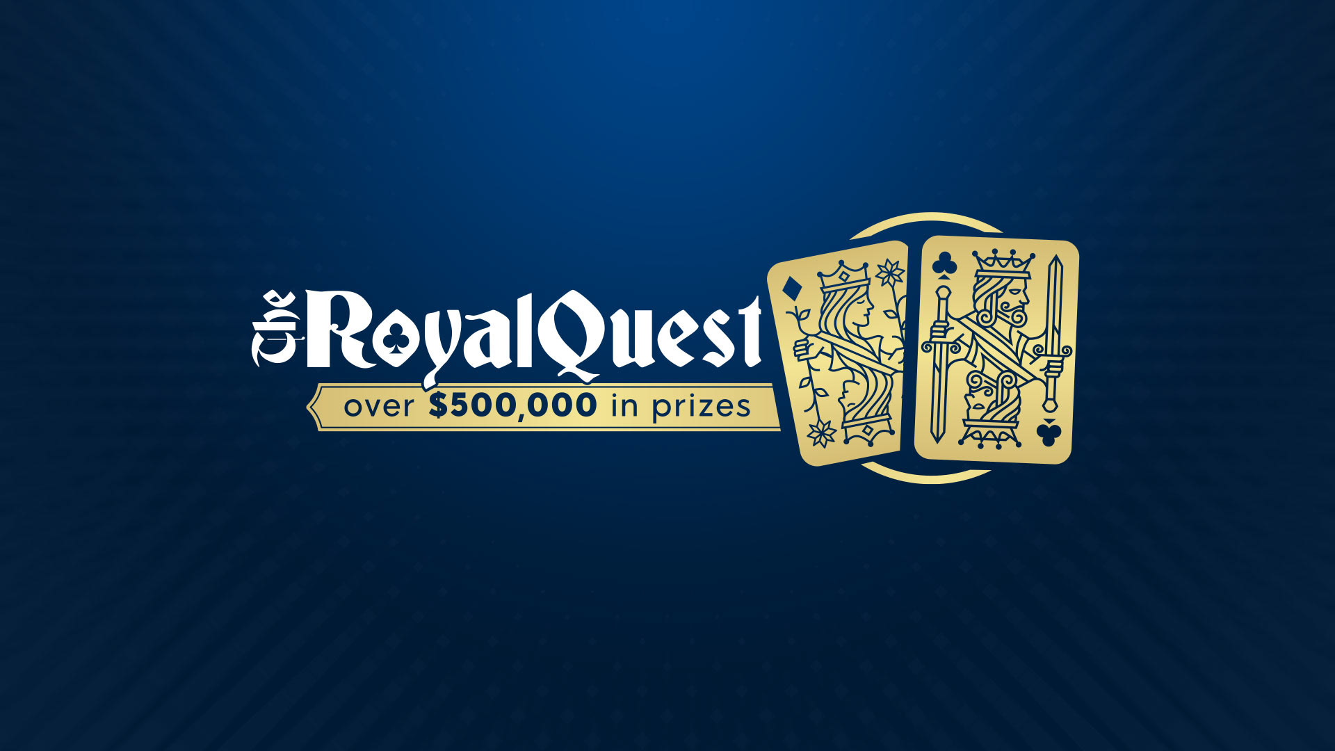
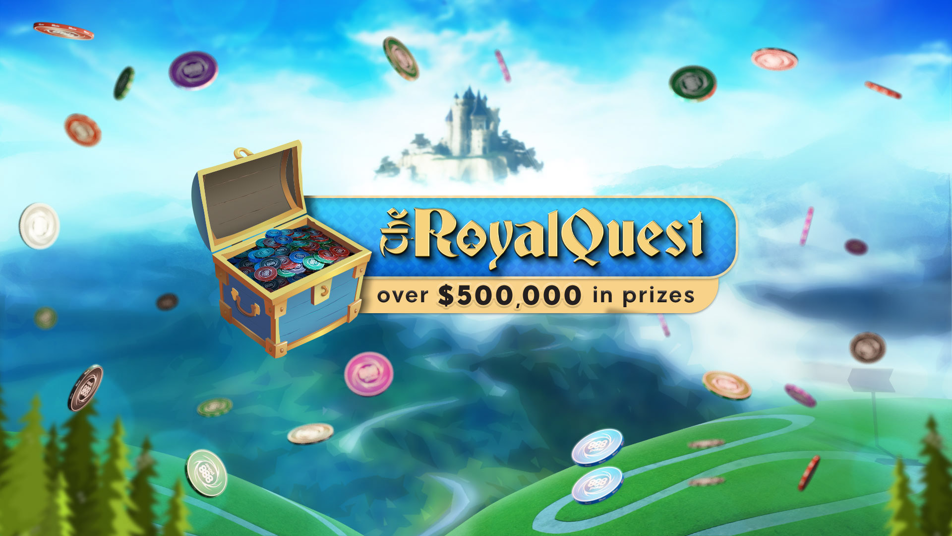
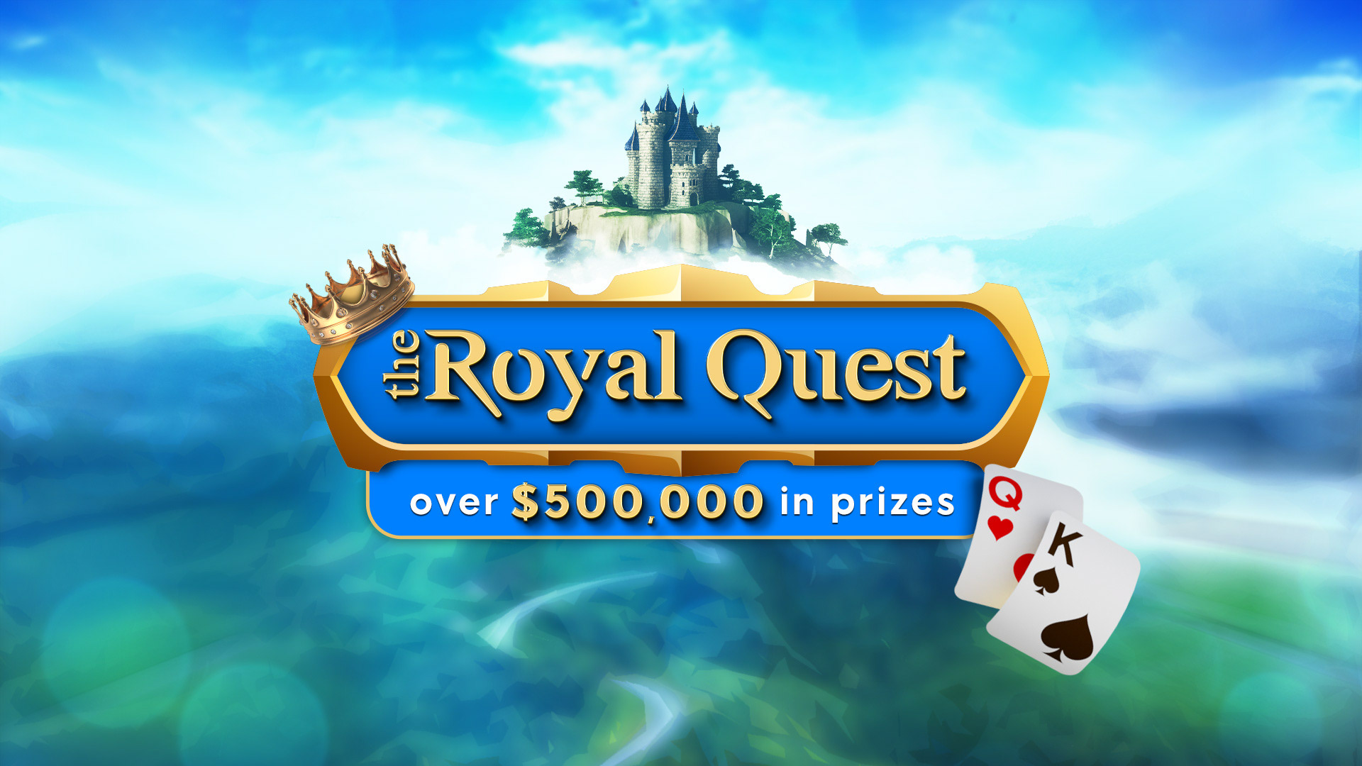
Campaign name: The Royal Quest
Objective: Players will become Kings and Queens, completing challenges for freeroll tickets. There will be daily, weekly, and monthly freerolls across three kingdoms/castles.
Theme: Royalty/Kingdoms
Goal: Increase player engagement and retention by offering daily, weekly, and monthly challenges with substantial rewards, attract new players through the allure of over $500,000 in prizes, and foster brand loyalty by creating a fun and adventurous environment where players feel valued and part of a royal journey.
The logo: is prominently displayed over a background featuring a majestic castle on an elevated landmass surrounded by clouds, reinforcing the royal and adventurous theme. The golden crown adorning the logo gives it an elegant and royal appearance, while the sophisticated font emphasizes the theme of nobility. The tagline, stating “over $500,000 in prizes,” highlights the substantial rewards associated with this campaign, bringing the important prize to the forefront. The playing cards depicting the King and Queen reinforce the idea of players being the royalty in this noble journey.
Overall, the design communicates a sense of adventure and the allure of winning a royal title in a grand quest.

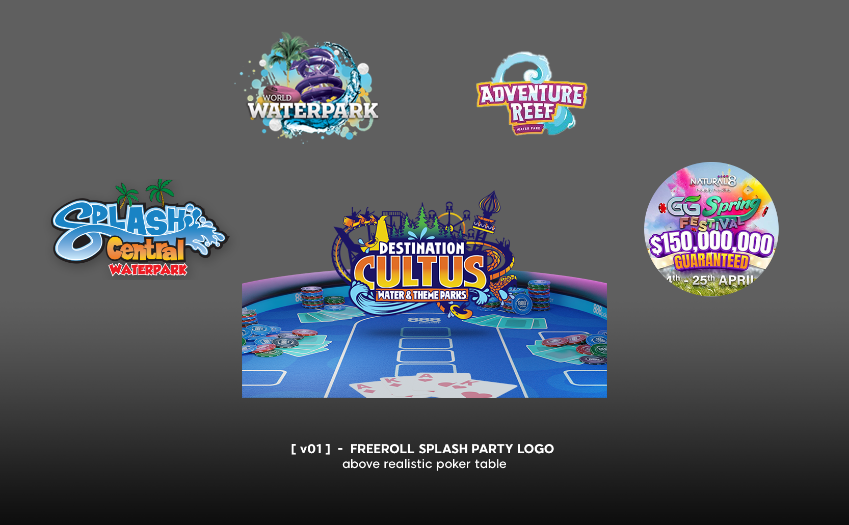
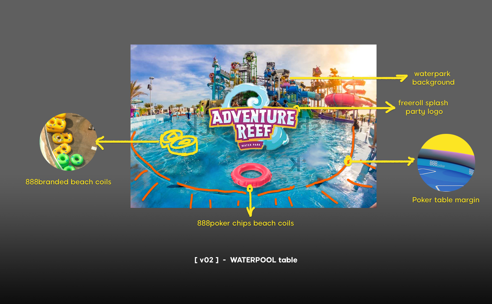
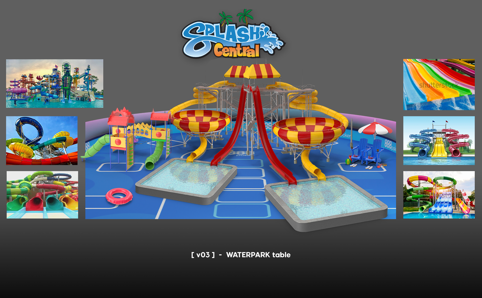
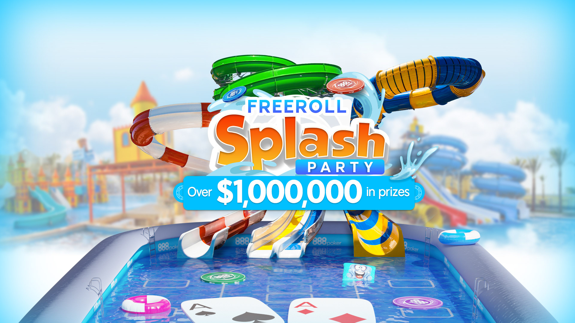
Campaign name: Freeroll Splash Party
Objective: Create an engaging and dynamic campaign with a summer-themed poker event. Play your favourite games to get tickets to the freeroll slides.
Theme: A massive summer party packed with freeroll waterslides and extra surprises.
Goal: The more challenges the player completes, the more tickets they’ll win and the more freeroll slides they’ll enjoy! Players can complete any combination of challenges to win tickets. Plus, any leftover freeroll tickets can be used even after the Splash Party ends.
The logo: bold and stylized with the tagline stands out over the animated and lively backdrop that includes water slides and pools, creating a fun and festive atmosphere that combines the excitement of poker with a summer splash party theme.

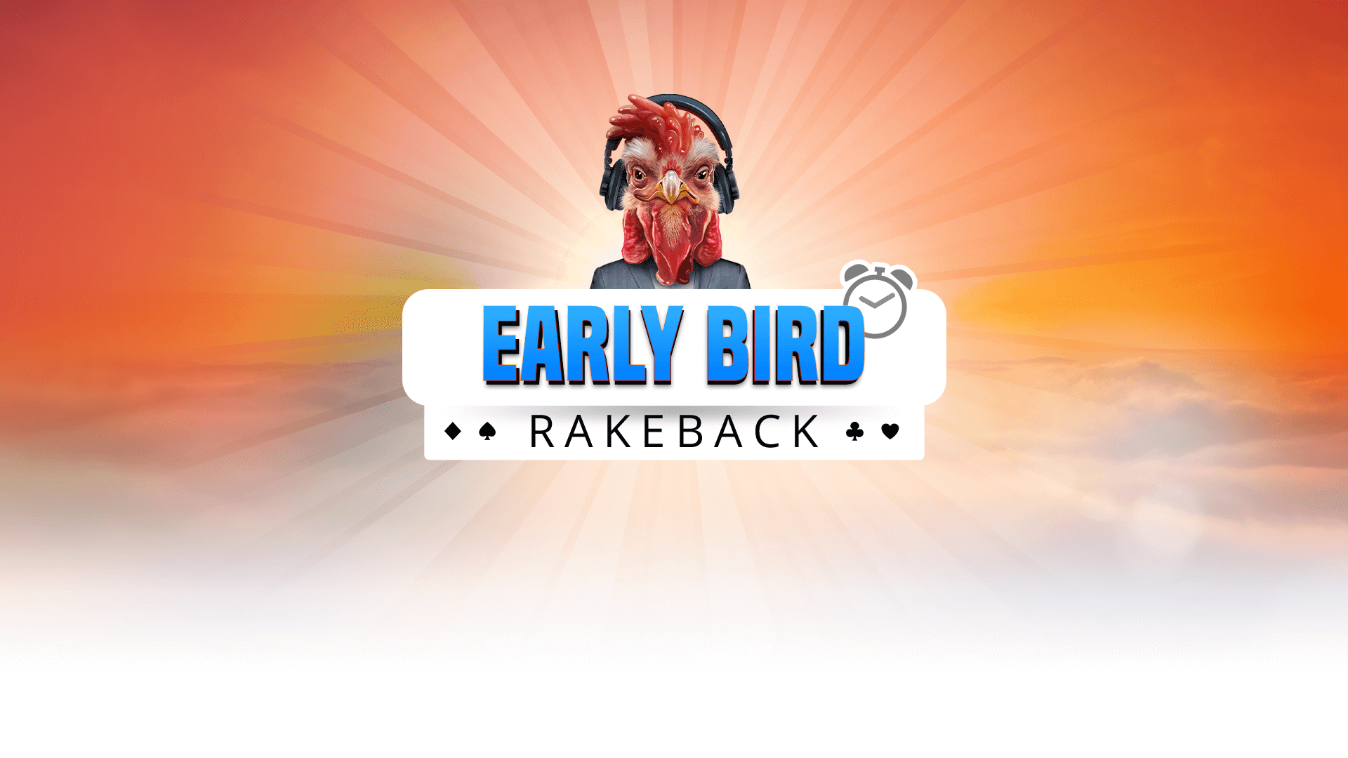
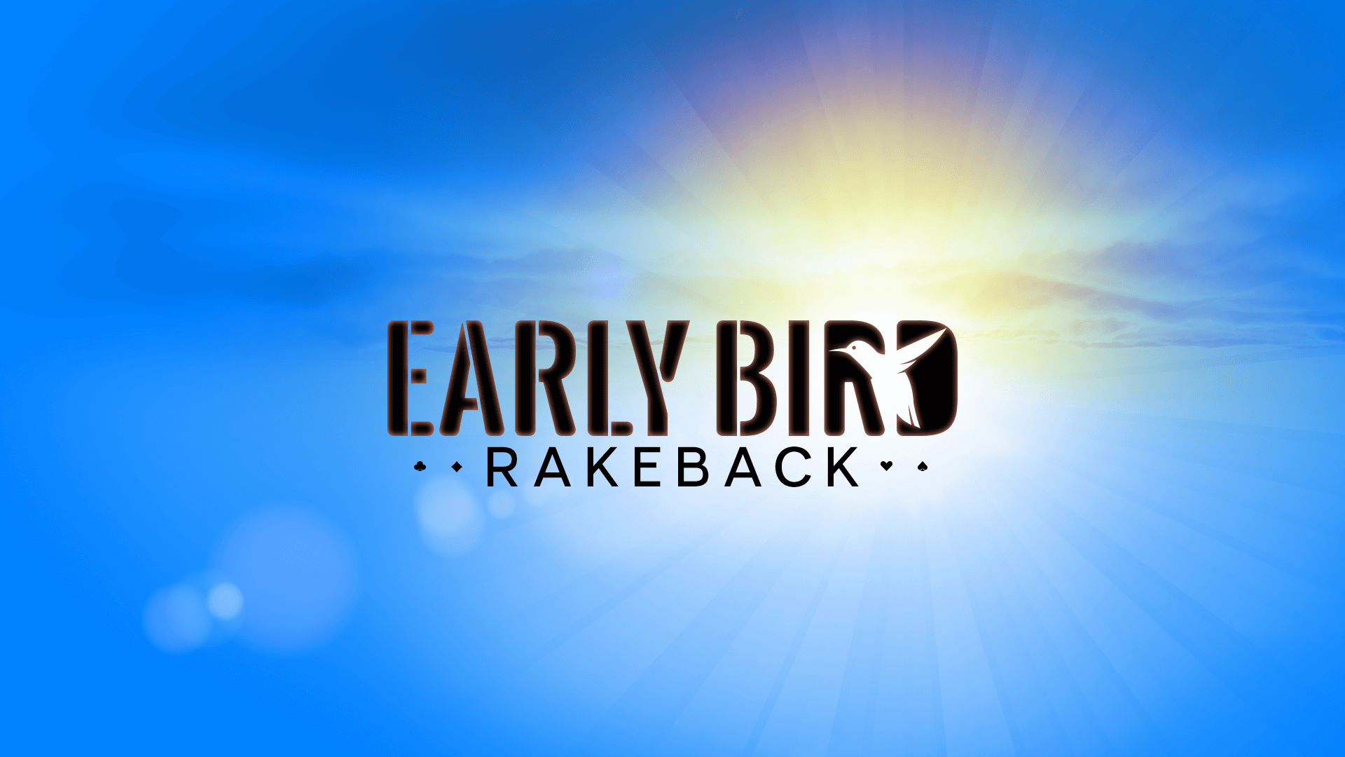
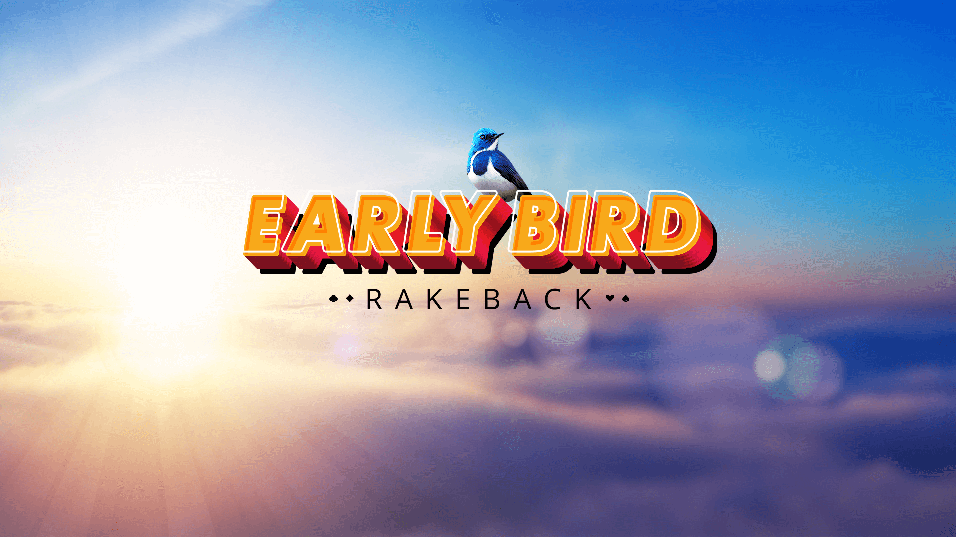
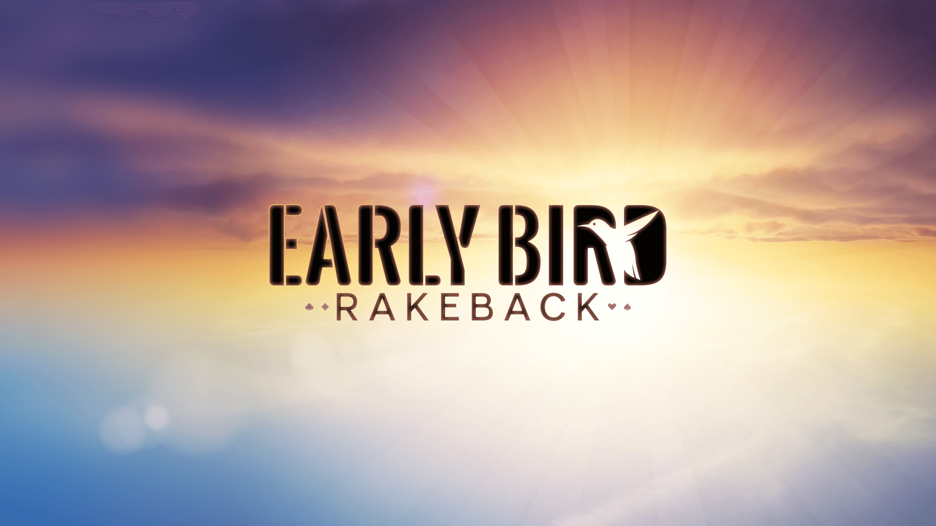
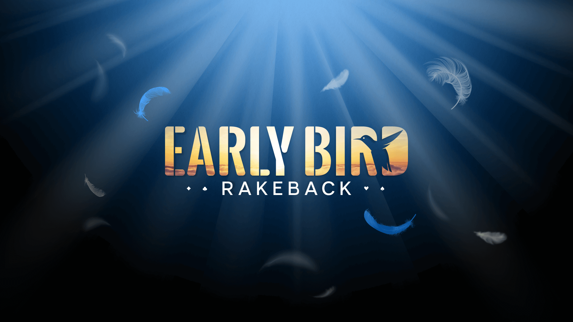
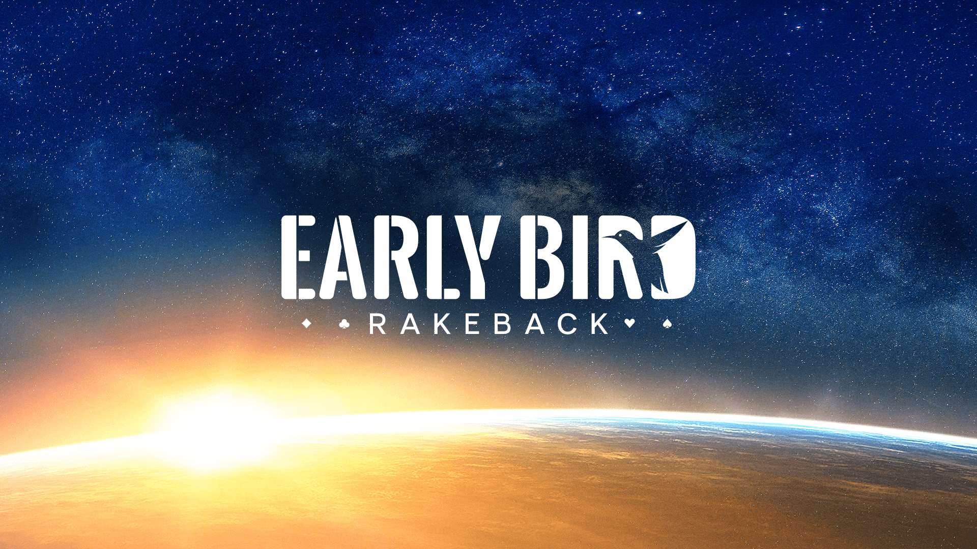
Campaign name: Early Bird Rakeback
Objective: The campaign aimed to encourage players to register early for tournaments and reward them accordingly, with incentives such as early-bird registration bonuses and rakeback offers. Keywords: morning, light, bird, time, early hour, freshness and rakeback.
The logo: Out of all the options presented, the one that emerged as the winner was the design that focused on the simple and uncomplicated logo. With that as the starting point, I began developing new variations and ideas, focusing on finding clarity and simplicity within complexity. After several iterations, I was able to create the final main image that perfectly encapsulated the brand's vision and values.